Color Psychology in Interior Design: Choosing the Right Paint Colors for Every Room in Your Home
Hey there, home decorator! Ever walked into a room and just felt something different? Maybe it was cozy, maybe it was energizing, or maybe it just felt… off? Well, guess what? That feeling might just be the magic of color at play! We’re diving deep into the fascinating world of Color Psychology in Interior Design today, and trust me, it’s way more than just picking pretty shades. It’s about understanding how colors can actually shape our moods, our energy levels, and even how we interact in our own spaces. Ready to transform your home from just walls to a mindful sanctuary? Let’s get started, shall we? It’s going to be a fun journey, I promise!
📌 Key Takeaways
- Colors have a powerful psychological impact on our emotions and behavior, influencing how we feel and act.
- Understanding the meanings and effects of different colors helps us create specific moods in each room of our home.
- Cool colors like blues and greens tend to be calming, promoting relaxation, while warm colors like reds and yellows are energizing and stimulating.
- Neutral colors offer incredible versatility, providing a balanced and sophisticated foundation for any design style.
The Gentle Hug of Cool Tones: Creating Calm Sanctuaries
Let’s start with the colors that feel like a soft, welcoming hug – the cool tones! Think serene blues, tranquil greens, and sophisticated purples. These colors are your best friends when you’re aiming for a peaceful vibe. For instance, a soft, muted blue in your bedroom? Oh, it’s like wrapping yourself in a cloud, perfect for drifting off to sleep. Studies have shown that blues can actually lower heart rate and blood pressure, making them ideal for spaces where you want to unwind. I remember painting my home office a light, airy green, and honestly, it made a world of difference during those stressful deadlines. It just felt like a little breath of fresh air, you know? It was so refreshing!
Calming Blues
Promotes deep relaxation and serenity. Absolutely ideal for bedrooms and bathrooms where peace is paramount.
Tranquil Greens
Evokes nature, balance, and renewal. A wonderful choice for living areas and studies to foster a sense of well-being.
Even a touch of lavender or a soft grey-blue can bring a sense of calm without feeling overwhelming. It’s all about finding that sweet spot where the color feels inviting and soothing, not cold or stark. We want your home to feel like a true haven, after all!
Igniting Energy with Warm Hues: Spaces for Connection and Creativity
Now, let’s talk about the colors that bring the warmth and the zing! Reds, oranges, and yellows are known for their energizing properties. Think about a vibrant dining room painted in a warm terracotta or a cheerful yellow accent wall in your kitchen. These colors can stimulate conversation, boost appetite, and generally make a space feel more lively and welcoming. A deep, rich red can create a sense of passion and intimacy, while a bright, sunny yellow can simply make you smile every time you enter the room! It’s like a shot of pure sunshine, don’t you think? It just lifts the spirit!
However, a word of caution! Too much of a good thing can be overwhelming. A whole room in fire-engine red might be a bit much for some, leading to feelings of agitation rather than excitement. The trick here is balance. Maybe a bold orange sofa in your living room, or a subtle coral in your entryway? These pops of warmth can really make a space sing without being overbearing. It’s about creating an atmosphere that invites people in and makes them feel a buzz of positive energy.
“Color is a power which directly influences the soul.” – Wassily Kandinsky. And isn’t that the truth? It’s amazing how a simple paint chip can unlock such deep emotional responses!
The Versatile Charm of Neutrals: A Foundation for Any Style
Ah, the neutrals. Grays, beiges, whites, and creams. They might seem a little… plain at first glance, right? But oh, the power they hold! Neutrals are the ultimate chameleons of the color world. They provide a sophisticated and calming backdrop that allows other elements in your room – like your furniture, artwork, and textiles – to truly shine. A soft, warm beige can make a living room feel incredibly cozy and inviting, while a crisp white can make a small space feel larger and brighter. They’re the foundation upon which you can build any style, from minimalist chic to bohemian warmth. It’s truly a smart choice!
Did you know that different undertones in neutrals can completely change the feel of a room? A grey with a blue undertone might feel cooler and more modern, while a grey with a warmer, greige undertone can feel much more inviting. It’s these subtle nuances that make Color Psychology in Interior Design so fascinating! And honestly, they’re so forgiving. Splashes of color can be easily introduced and changed with accessories, keeping your neutral base feeling fresh and timeless. It’s a smart choice for long-term style!
Neutral Palette Inspiration
Creamy Beige
Cool Gray
Warm Greige
Crisp White
Putting It All Together: Your Action Plan
So, how do you actually choose the right paint colors for your home? It’s not as daunting as it might seem! Start by considering the function of each room. What do you want to feel when you’re in that space? Relaxed? Energized? Creative? Focused?
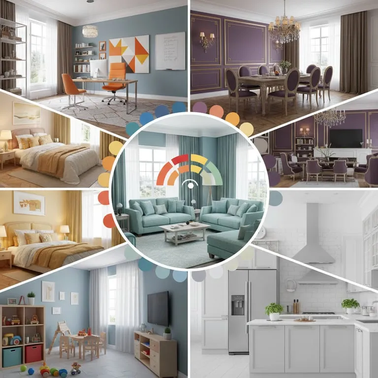
- Bedroom: Aim for calm. Soft blues, greens, or muted purples work wonders for promoting rest and tranquility. Think deep, restful sleep!
- Living Room: This is your gathering space! Consider warm neutrals for a cozy feel, or perhaps a soft green or blue for a balanced, inviting atmosphere that encourages conversation.
- Kitchen: Often the heart of the home, kitchens can benefit from cheerful yellows, energizing oranges, or even clean whites to feel bright, clean, and inviting. Let the cooking begin!
- Home Office/Study: Focus and creativity are key here. Greens and blues can aid concentration, while a touch of yellow can spark creativity. Get that work done!
- Dining Room: Encourage conversation and appetite with warmer tones like reds, oranges, or earthy browns. Make mealtime memorable!
Don’t forget to test your paint colors! Grab a few samples and paint large swatches on different walls in the room. Look at them at different times of day, under both natural and artificial light. Colors can look dramatically different depending on the lighting conditions, and that’s a super important detail to get right! It’s like seeing them in their true light.
Frequently Asked Questions
Can I mix warm and cool colors in the same room?
Absolutely! It’s all about balance and intent. You can use a neutral base and strategically add accents of both warm and cool colors to create a dynamic and visually interesting space. For example, a sophisticated gray room (cool neutral) could be beautifully complemented by warm wooden furniture and then punctuated with cool blue or teal accents for depth.
What color is best for a small room?
Lighter, cooler colors like soft blues, greens, whites, and light grays tend to make small rooms feel significantly larger and more open. They reflect more light, creating an illusion of expanded space. Think of them as visual “air” for your room!
Does color psychology apply to all ages?
Yes, the fundamental psychological effects of colors are generally consistent across ages, though individual preferences and cultural associations can certainly play a role. For children’s rooms, you might lean towards brighter, more stimulating colors, while still keeping the core principles of mood and energy in mind for healthy development.
How do I choose a paint color if I’m overwhelmed?
Start with your absolute favorite color or a color that evokes a feeling you truly love. Then, explore its lighter, darker, or more muted shades. Look at your existing furniture and decor for inspiration. And remember, sampling is key! It’s much easier and less costly to repaint a small swatch than an entire room. Take your time and enjoy the process!